1
Analysts Think in One Mode at a Time
A combined institution-and-product view confused them. They had separate use cases for when they were seeking product-related versus institution-related data.
LendSight is a B2B SaaS dashboard that gives community banks and credit unions the deposit pricing intelligence that only large banks could afford before. It's built on public FDIC, FFIEC, and NCUA data.
The product started at the Georgia Tech Financial Services Innovation Lab. The Lab had the research and the federated data feeds but no product. I joined as the lead designer with no existing designs and no design system, and over ten months I took it from concept to a working product now in pilot with a Georgia-based credit union.

A Georgia-based credit union is piloting LendSight live and sending back suggestions that shape the product. So far the pilot has cut analyst time on weekly benchmarking by about 40 percent. The predictive model runs inside the pilot and gets refined by the credit union's feedback. The next step is to roll it out to more small banks and credit unions.
"A tool like this could reduce manual work, especially when analysts need to communicate with higher-level decision makers."
Georgia credit union member, pilot review
Large banks set deposit rates using platforms like Curinos and S&P that cost fifty thousand to five hundred thousand dollars a year. Community banks and credit unions can't pay that, and their margins depend on getting deposit pricing right just as much.
Their fallback is manual. Analysts pull FDIC and NCUA filings by hand, copy the numbers into spreadsheets, and rebuild the same comparisons every week. A basic question, like what the market is doing on six-month CDs in Atlanta this week, took two days to answer. Turning that answer into a one-page CFO summary took two more.
LendSight sits deliberately below the enterprise pricing tools. It runs on a shared Supabase backend with an OpenAI integration for natural language queries. The product has two main features.
Analysts benchmark deposit and lending products against competitors across product, term, deposit amount, institution type, geography, and demographics. The results render two ways: an interactive chart, or a sortable table. Changing a filter repaints the view in place, so the tool moves at the speed of the analyst's questions.
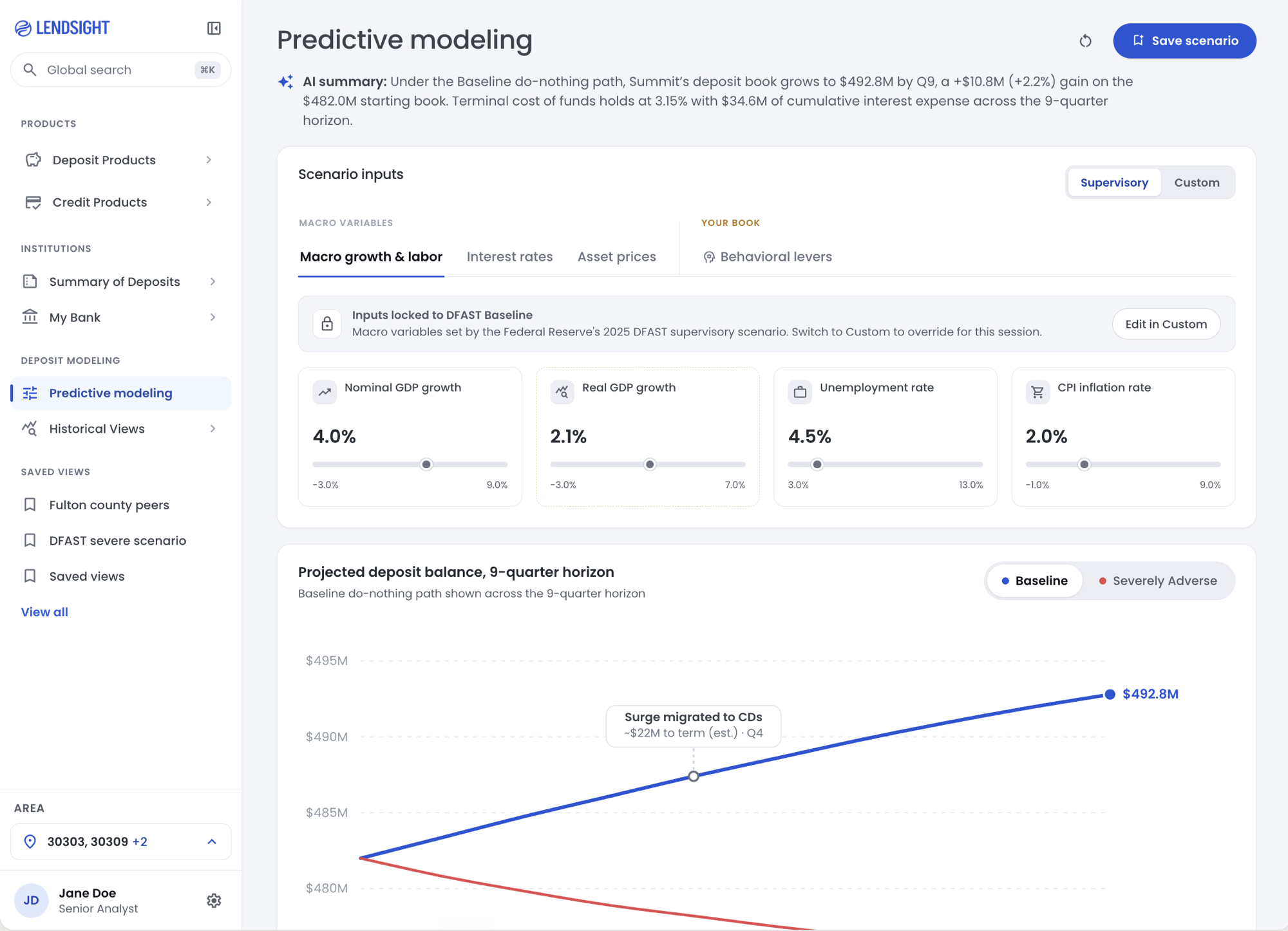
An analyst sets a target APY, then adjusts macro inputs like GDP growth, unemployment, and Treasury yields. The model returns projections under Baseline and Severely Adverse conditions over a quarterly or annual horizon. A tornado chart ranks the inputs that drive the forecast.
Working at a research lab gave me stakeholder access most designers never get. Over three months I ran over ten structured interviews with pricing analysts at Bank of America, Charles Schwab, and Experian, two finance academics, and both analysts and a board member at the Georgia credit union. A FigJam workshop covered problem framing, users, data sources, and prioritization.



A combined institution-and-product view confused them. They had separate use cases for when they were seeking product-related versus institution-related data.
A filter that takes two seconds breaks the workflow. The dashboard had to feel like a spreadsheet that paints itself.
Knowing a bank offers 4.5 percent isn't enough. Analysts also want to know how strong it is, how recently it moved rates, and whether it's a real competitor.
A community bank has no house view on the 10-year Treasury. The Fed publishes the scenarios, and the bank models its own book against them. This finding split the model's inputs into three groups, Fed-published, bank-owned, and model-owned, and became the spine of the module.
The bank sets its own data once a month: its deposit book by product, its current offered rate, and behavioral assumptions like deposit beta and runoff rate. The Fed provides ten economic paths across nine quarters. The analyst chooses which scenario to run. The model converts the macro paths into deposit flows and produces a nine-quarter balance path and cost of funds, shown as a sensitivity tornado, a cost-of-funds view, and a projected balance with baseline and adverse scenarios.
I built every component in Figma, documented it in Storybook with variants and states, and saved it as tokens for Claude Code. Color, type, spacing, and motion tokens map one to one from Figma into the build, so the product looks identical to the design file.
Building the system in month two was a decision I'm glad I made early. The screens are dense, and consistent tokens and components kept them readable as the product grew. I've covered the system in a separate case study.
The first build combined both contexts on one canvas, so analysts toggled between two mental modes and lost their place. Splitting the views lowered cognitive load and shortened the path from question to pricing decision. That structure carried through the rest of the dashboard.

One canvas that mixed both contexts became a focused, single-product view. Analysts stopped losing their place between modes.
The original layout kept filters in a side panel, which narrowed the canvas and added friction to a cycle analysts repeated all day. Moving the filters to a sticky top bar freed the width and sped up the loop. The collapsable side nav now handles module switching.

Filters left the side panel for a sticky top bar. The canvas widened and the question-to-answer loop got faster.
The initial design split data upload and model runs across two screens. The data changes once a month, but analysts run the model many times in a session to test what-ifs, so splitting by screen sent them back to setup on every run. So, I split by cadence instead. The monthly upload moved into a drawer that opens only when the data changes. The analysis lives on one screen where analysts adjust inputs and read results together. This made the what-if loop work faster.


Inputs and outputs moved onto one screen so the what-if loop stays intact. Monthly setup moved into a drawer, splitting the flow by cadence instead of by control versus output.
I designed in Figma with the token system as the source of truth, rebuilt the high-priority screens in Claude Code using those same tokens, and documented each component in Storybook before it reached the live app.
Each weekly cycle moved from Figma to a Claude Code build to Storybook docs to a demo with the credit union, then back to Figma. The cycles took hours rather than weeks, which meant a feature requested on Monday could reach the pilot the next Monday.
Working in real code surfaced issues a static file can miss. Filter behavior that reads well in Figma can break when four filters are applied at once and the chart redraws. Seeing that early let me fix the design instead of patching the build.
 Figma
Figma
 Storybook
| Prop | Type | Default |
|---|---|---|
| state | enum | default |
| active | boolean | false |
| disabled | boolean | false |
Piloting earlier was the thing I'd change most. The most useful feedback of the whole project came from the first credit union session, so getting there in month two instead of month four would have saved a round of overbuilt work.
The design system was the right call. Building it early kept the dense screens consistent as the product grew, and skipping it would have slowed everything that came after.
The roadmap is to roll the product out to more small banks and credit unions and add a second pilot institution for cross-validation.